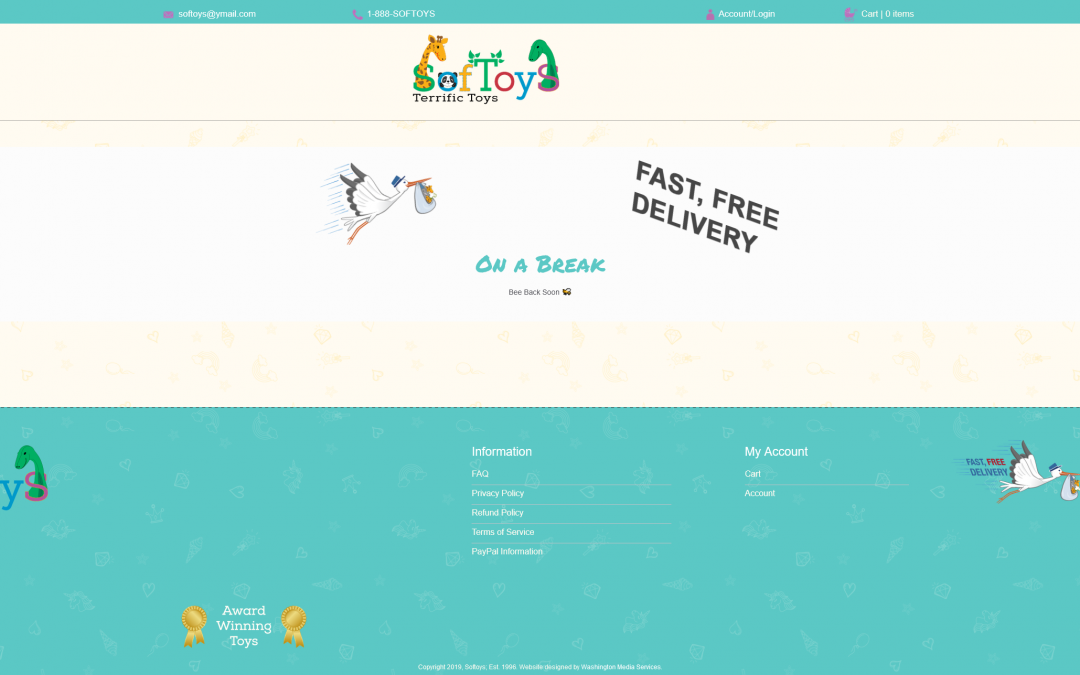
If we thought their logo was fun, then making their website was out of sight! Softoys former website had been built… a while ago. They wanted a new site that looked more updated, fun, and more modern. This alone was fun. When the client told us that it needed to be colorful, WMS staff pulled out all of our Pantone color books and pulled a lot of colors to test. We chose somewhat muted yellows and a mint-like color for the base. This choice would allow both their logo and the images of their toys to stand out. We started with a minimalist design, but then had to break a few rules. This had to be fun-looking, remember? We created some patterns and searched for textures to try to let the site feel like a kid’s room or like it was part of a baby shower (one of the suggestions the client had given us).
This build was created using WordPress and is an e-commerce site.


