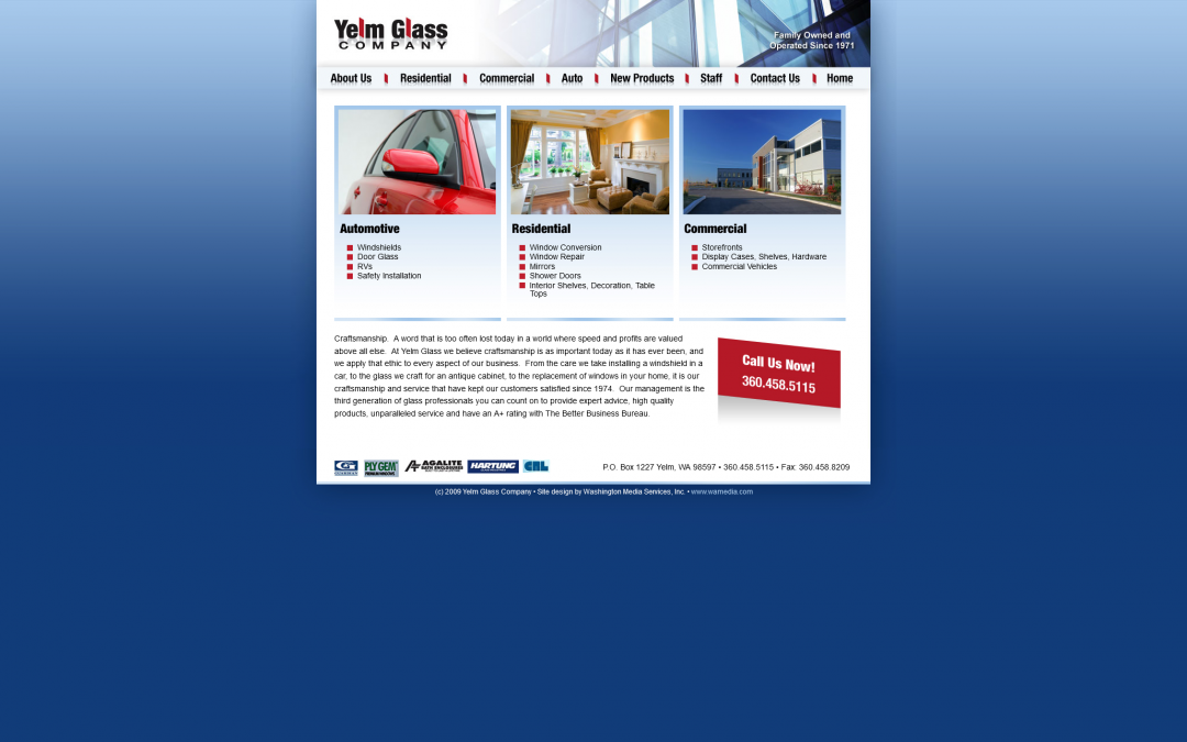
This is a great example of a simple little website. The design is simple, using white space to highlight the text and make sure it’s not crowded. A three-column layout with good-sized thumbnails on the home page accentuates three of their main services: automotive, residential, and commercial. Soft blues keep everything down-to-earth, and punches of bright read lead the eye to just the right spot. A might-fine website!


